Inspiring Older Readers
 posted on 10 Sep 2026
Judging a book by its cover
You’ll be familiar with the cliché that you can’t judge a book by its cover and I suppose cliché achieves that status by having at its heart a kernel of truth. But lately I’ve been wondering whether in the case of long-term readers and book collectors, the very opposite of that maxim operates.
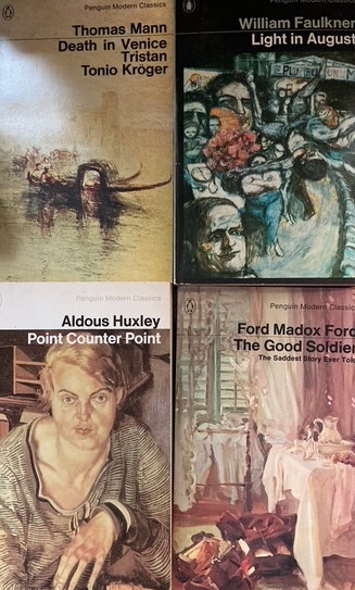
In a recent exchange of email with a long-standing friend, fellow-reader and contributor to this website, I confessed that so many books I purchased in my younger days were the direct result of an infatuation with the way Penguin Modern Classics from the early 1960s until the early 1980s were designed and presented. This was the work of Germano Facetti who made some tweaks to the typeface used up to that time on the jackets and, although he retained the distinctive grey background identity, replaced the images on the front cover with full-page details from great artwork he felt was in sympathy with the author and content. (For those interested more in this, you can check out this entry on the Penguin Series Design website
https://penguinseriesdesign.com/2024/06/17/making-the-modern-classics-modern/)
For me these Penguins provided a double hit – finding out about books and art all in one package. Irresistible. Even though I’ve gone on to be a much more covetous book collector, I still look back at the acquisition of those wonderful objects as the most thrilling of book-hunting experiences.
As I’ve got older and considerably longer in the tooth, I’ve also come to realise that even today I’m often more familiar with the book and its cover than I am with the content. Indeed, I seem to have moved seamlessly to believing that having the book was effectively the same as reading it. I look back and I can say with some confidence that many things I think I’ve read I haven’t but I have owned a copy of the Penguin Modern Classic from that era, sat it on my shelves for years and can, in tranquillity, conjure the whole look and feel of the book in my mind in detail.
So, you might conclude, this brazen judging of a book by its cover can be put down to callow youth and inexperience – but no. I’m still at it and I’m most certainly not alone – and the publishing industry most certainly knows it. The book cover has always been a key marketing tool for publishers and booksellers as individual books fight for recognition in an otherwise crowded market as Clare Thorp noted in her 2020 article for BBC Culture, ‘What Makes an Iconic Book Cover?’
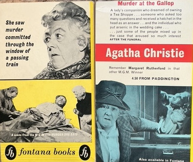
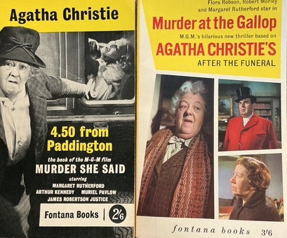
All of this is an extended apologia for the fact that when I say ‘I’m still at it’, I mean it and only the other day I found myself stumping up good money for two Agatha Christie Fontana paperbacks from the 1960s – 4.50 from Paddington and After the Funeral. And why? I’m not an especially huge fan of Christie (she’s good holiday reading), I have other anthologies, so why these paperbacks? Simple. The covers. They are film tie-ins with the immortal Margaret Rutherford’s Miss Marple interpretation in movies I still love.
Am I going to read them? Maybe. Will I lovingly admire the design kitsch of the covers – always.
Terry Potter
September 2026